02
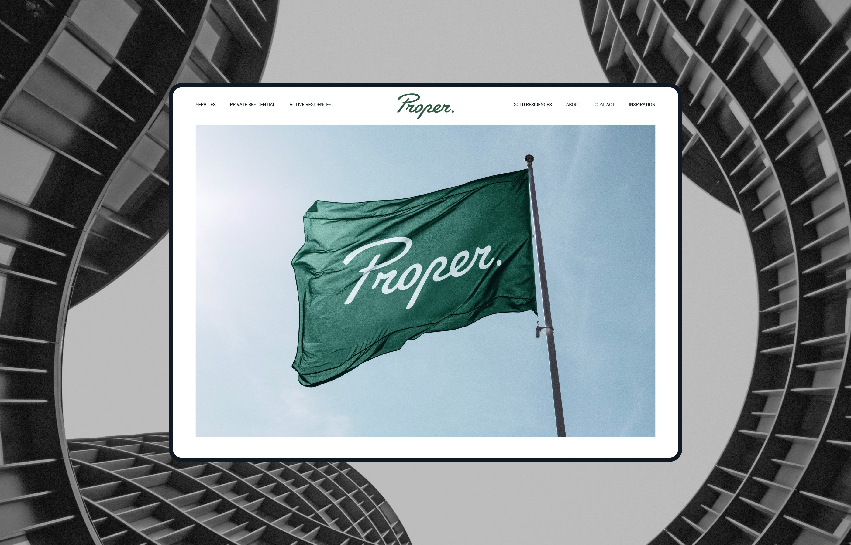
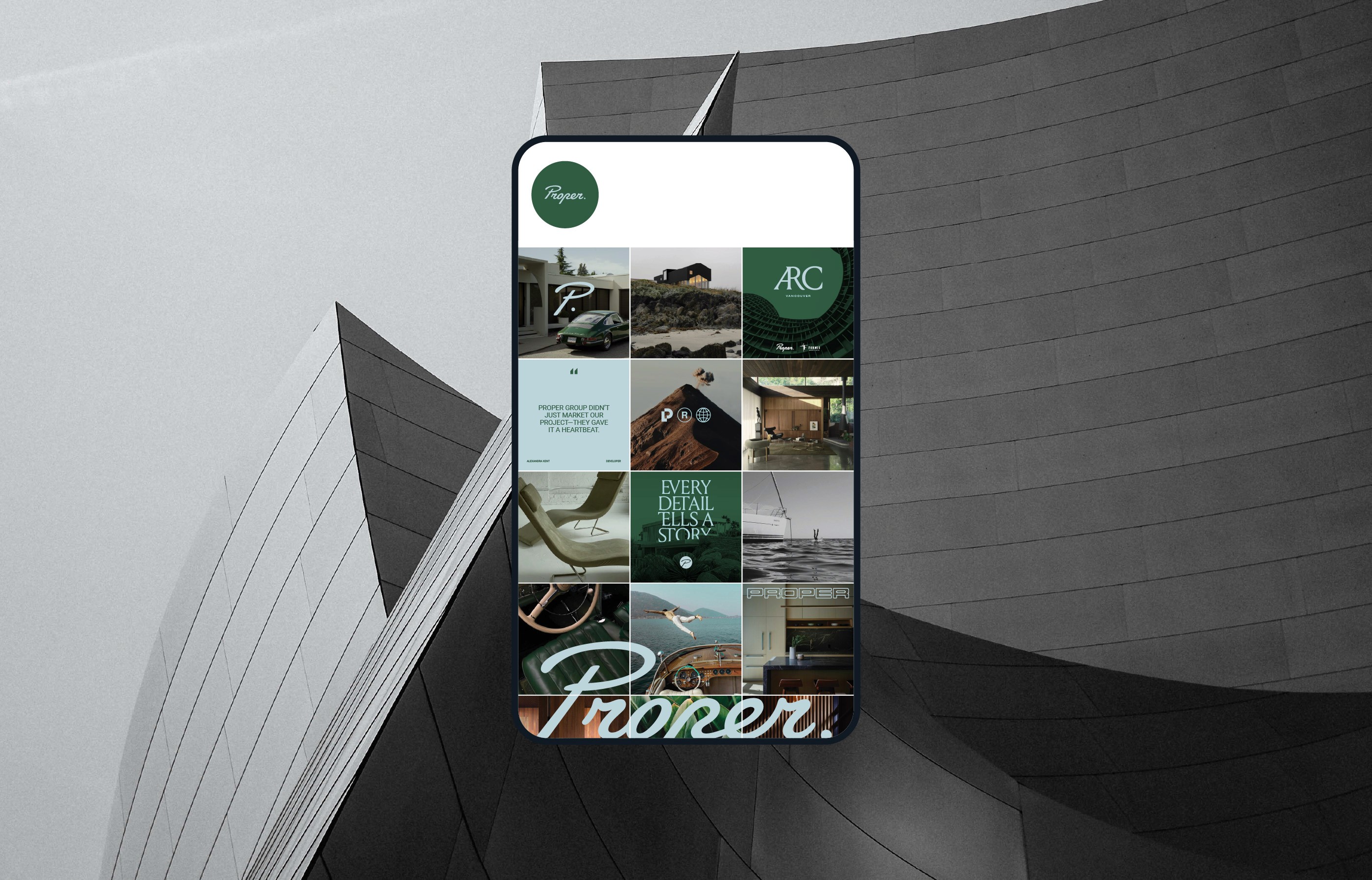
Proper
Services
Strategy, Branding, Print, Digital
Client
Proper Group
Industry
Real Estate
Year
2025
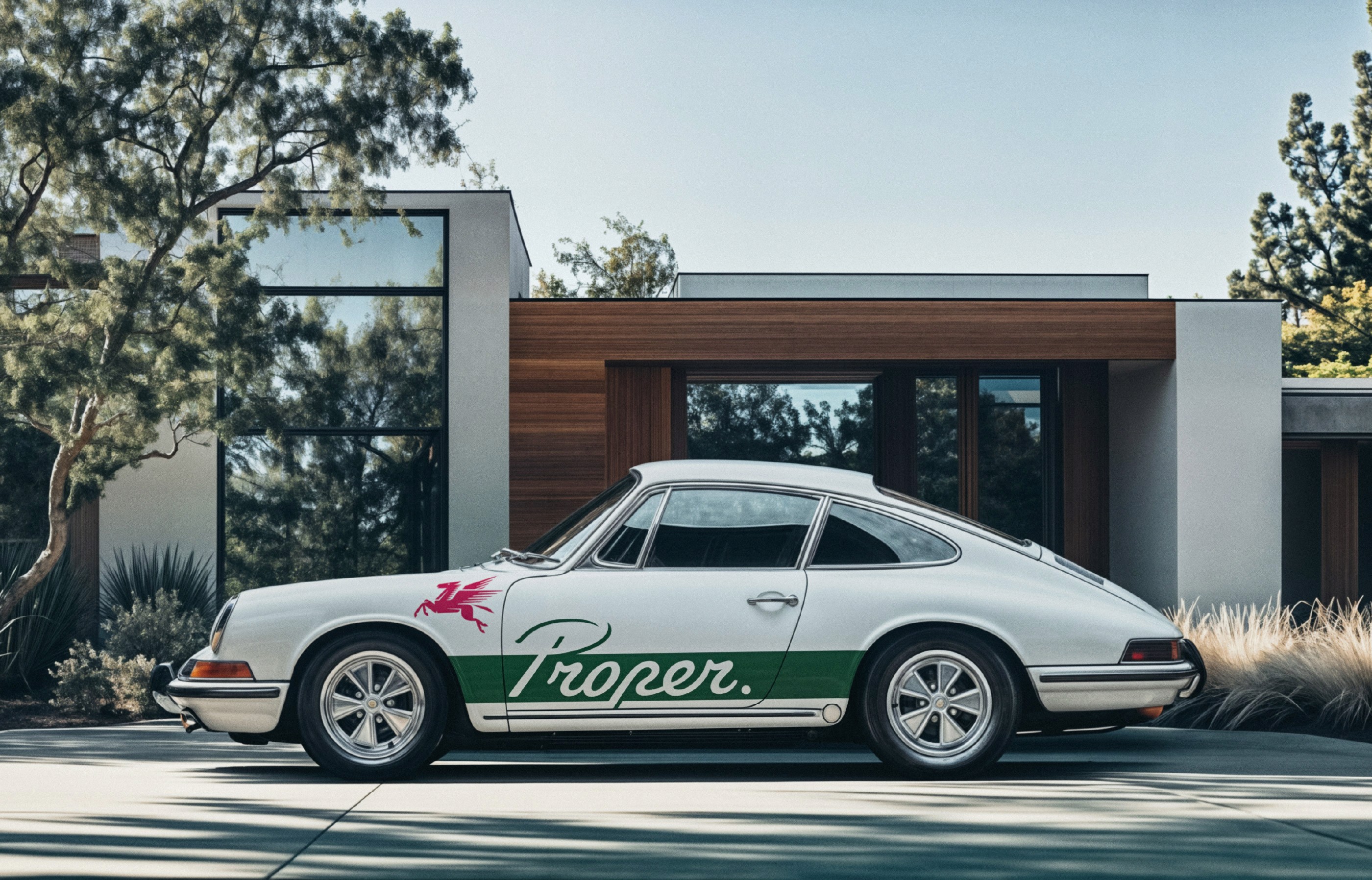
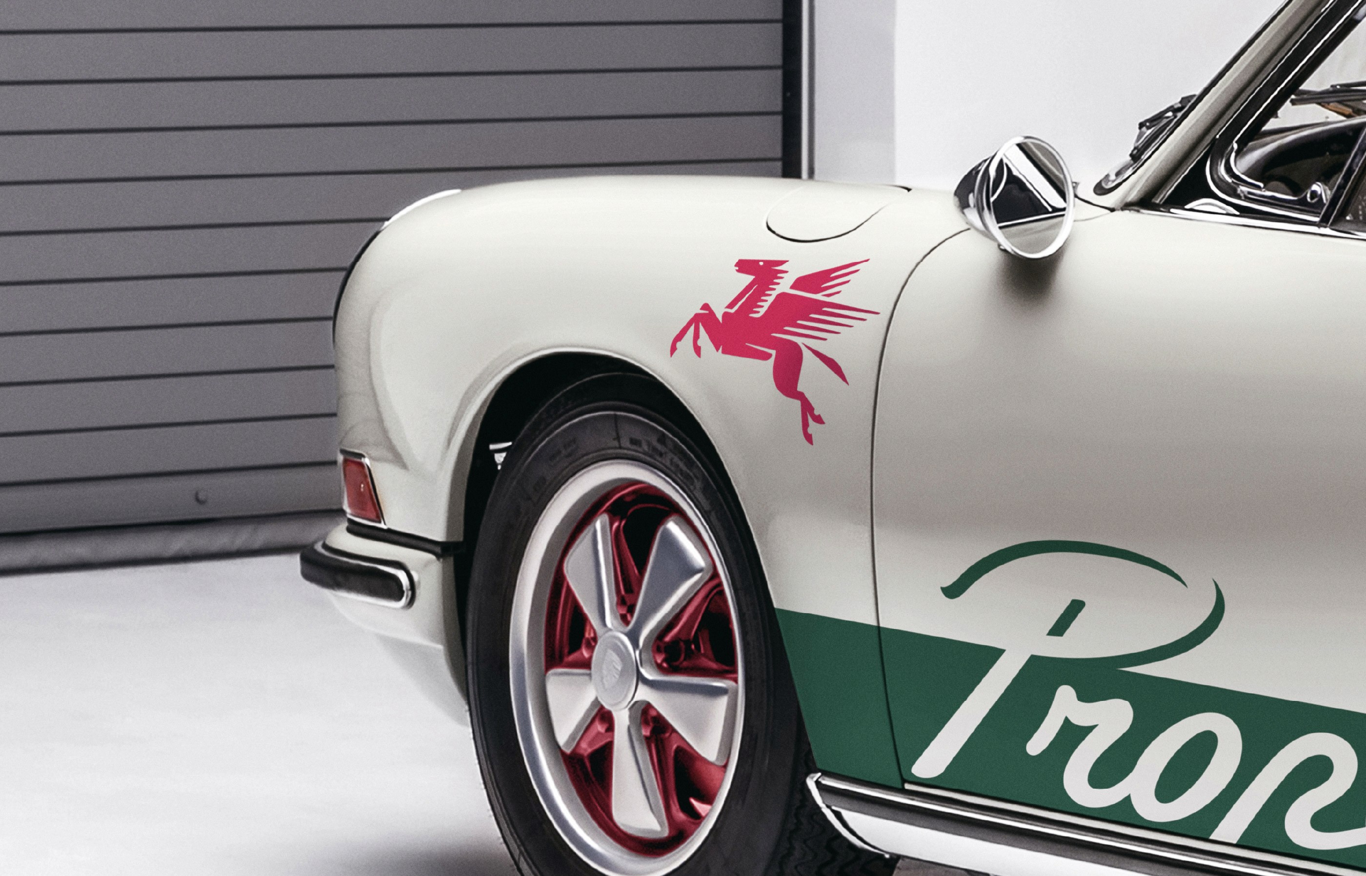
Proper entered a saturated real estate market shaped by sameness, reframing marketing through design, narrative, and lifestyle. The identity draws from vintage racing culture, translated with modern sensibility. A custom script wordmark grounds the system with expressive precision, while the Pegasus symbol signals upward momentum and creative ambition. Typography merges retro ligatures with contemporary structure. A palette of British racing green and Gulf blue nods to heritage without nostalgia. Styled, editorial photography ties the brand together across digital, print, and merchandise. Built for boutique developers and design-conscious clients, Proper presents a focused and lifestyle-led alternative. Refined. Distinctive. Grounded in taste.


Latest
Projects